It is hard to believe that Disney’s streaming service has already been around for over a year. As I live in Europe, we had to wait a bit longer to get our hands on it, but overall, I’ve been enjoying my experience with it. The service is still in its early phases of development. So, it would be unfair to compare it with Amazon Prime or Netflix directly. There are still some aspects I have been thinking about lately that would improve the overall experience, as well as add something unique to Disney+. We already heard the news of it being potentially expanded with R-rated content shortly, so I will not be tackling that here. Here are just some general issues I’ve had and hope to see adapted or added in the future.
Time for a UI-Redesign
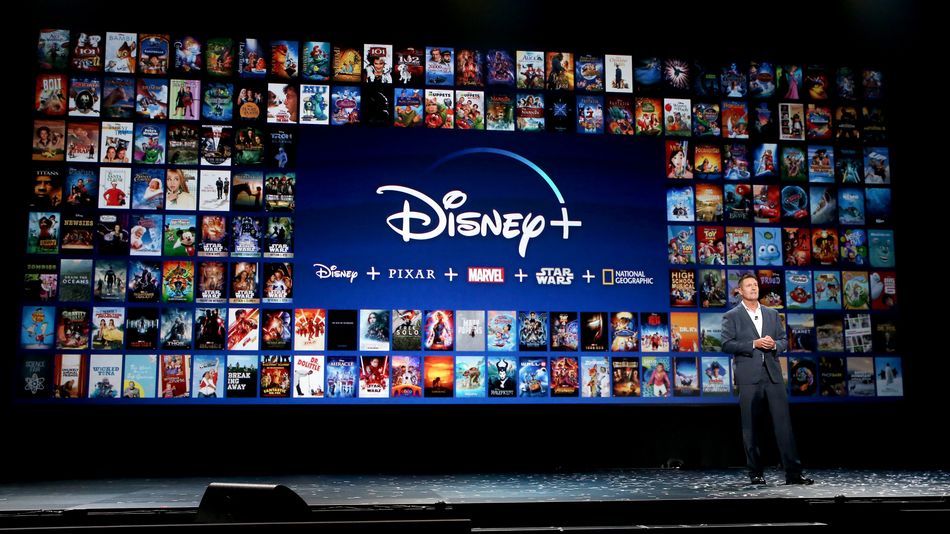
I think the overall user interface is rather bland. It has all the main staples, such as a massive banner on the latest updates and different sections based on your interaction with the app. Of course, one of the earliest selling points were the unique banners highlighting the various major brands ranging from National Geographic, Star Wars to Marvel. Now, it is a great idea in concept, as it allows you to find the type of content you are looking for. Yet, it’s the only thing that stands out for the entire interface. It’s an odd juxtaposition between the vibrant blue of the Disney+ logo and the strangely dark and grey background of the app. I am generally a fan of flatter designs that could add some unique flourishes. Actually, why not just offer different design options to highlight one’s favorite brand. Marvel fans can highlight the films and shows like comic covers. Did you grow up with the Disney channel? Why not offer a design that pays tribute to that?

Overall, I think as the subscriber numbers rise, it is time for a redesign. It was smart to make a basic design that people are familiar with so that they can easily find their way around the app. Now, Disney+ needs to stand out among the rest. They can keep the channel concept that was popularized by Netflix and Amazon but try to make it their own. They could make the shows stand out in a unique matter with short animations. Everything is tiny on my television. They have weekly release schedules for their Originals, but no information to showcase that directly in the app. Unlike Netflix, why not showcase upcoming releases so users can bookmark them on the front page. While the current season of The Mandalorian has no breaks, there is no issue but last year’s release did. So, making it easier to see various upcoming additions outside of Social Media for casual viewers could help the experience.
Need for UX-Optimization
Now that we discussed the visual changes, some usability aspects have been rather frustrating at times. I’ll start with a personal issue I’ve stumbled upon quite often. There is a strange restriction on how I can rewind what I am watching. Instead of selecting a specific time, it seems to allow me to fast-forward or to skip by 10 seconds, but that is it. Now, this could be a restriction by the app on my television but it still at times gets frustrating when it doesn’t remember where I left off. Also, if I select a show that I have currently watched, it jumped directly into the episode. Now, it didn’t remember that I finished it, but if I press to go back into the content-specific menu, I always end up back on the main menu. Now, I have to find the show I was watching to select the correct episode or check how many are potentially left. They don’t take away from the actual content that is offered but hampers the overall experience.

My last gripe is connected to various shows that are available. Some shows’ broadcasting schedule did not match the chronological one. It is something that was shared online, especially with shows like Star Wars: The Clone Wars. Its actual pilot was a film that is a separate option. So, if you are jumping into the series for the first time, you don’t realize that you’re missing an essential aspect of it. Marvel Rising consists of multiple short films that are all separately available properties. Instead of just offering them in chronological order, you have to look up a list online to figure out which one is the one you are looking for. This problem isn’t unique to Disney+, as Netflix has a similar approach with the Christmas special of Aggretsuko, which is canon, being a separate entity from the rest.
I am curious what the future holds for Disney’s first venture into streaming. It isn’t perfect and has some potential to grow, especially if they add more mature content through Disney+ Star. There are other elements I would love to see added, such as a Marvel Cinematic Universe showcase, which could adapt the various films and upcoming original shows in the order of the official timeline. The same would be helpful for the Star Wars franchise, which consists of three unique time periods and may only expand in the future. I’d be happy enough if they give us some options to individualize our set-up. It is family-friendly content, so why not offer some fun before checking out the latest DuckTales reboot?
Leave a Reply